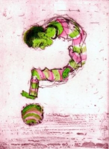
The following is an excerpt from the article “Color Language” in our Spring 2011 Newsletter, where six WPG artists reflect on color and its role in their prints. See the full article in the newsletter, at the link above.
Usually I am intuitive about using color, though I often end up using complementary colors. I guess you could say I want the colors to vibrate and be alive to the eye. Some of the earliest hand-coloredprints on paper that I love are the playing cards and devotional images from the fourteenth century. Their beauty and simplicity inspire me. For this etching, I printed in two ways. One impression was printed once in red ink, then hand colored with watercolor. I also double-drop printed the plate: the plate was inked in red, printed, inked again, and printed again on the same paper. The hardest part of this type of printing is accurate registration of the plate, but the result of wet-on-wet ink is a softness of the edges. ~ Vicky Vogl
For me, color expresses moments, ideas, or moods. In this piece, I was concerned with using a more organic palette to show a time of meditation and contemplation. For me, colors that are more organic or natural represent a pausing in time, a time for reflection and patience. The title of the piece “Figuring It All Out” refers to the pause in time before a major decision is made: the weighing of pros and cons, and the constant stream of thoughts that help inform you when making the decision. ~ Allison Long Hardy
Like many of my prints, Coffee Shop deliberately exploits several advantages of printing by hand with custom color inks, compared with printing using ink jets or commercial offset lithographic processes. (1) Machine printed gray colors are ‘complex’ colors, i.e., these colors are simulated using a combination of several process colors. Machine printed greys can be ‘muddy’ for a number of reasons. However, the screen printed cool grey ink in the print was custom-mixed and printed in a clean, single pull, thus avoiding issues of registering multiple colors. (2) Likewise, a color ‘between’ process colors, such as the purple (between cyan and magenta), was printed with a single ink in one clean pull. (3) Finally, unlike machine half-toning, the printmaker preparing an image and printing by hand can easily mix, match, and explode various half tone processes to obtain interacting color effects, quite discernible to the viewer. The window reflections in Coffee Shop use such mixtures. ~ Michael Hagan


Your spring issue is excellent.
Thank you! The artist members in charge do a great job putting it together, I can’t claim any part of it.